Pages

Sunday, December 15, 2019

Season to Sparkle


Join us in our monthly Technique Blog Hop during the Season to Sparkle! Go from blog to blog by following the links to see all the shiny art we have to share...


You've arrived from
Alyson Mayo's blog. If you get lost, Rudolph will light the way (or you can find a list on Melissa's blog).


This theme was hard for me because it's more along the creativity line, which is NOT my forte! At first, I wanted to use EVERY sparkly, shiny, glittery product we have; but I was able to refrain myself.


I looked at some of our fabulous How To books then I went to the CTMH Cricut Collections. Now that ALL of them are available to purchase, I had thousands of image choices!  So, which collection claims this image? One of the limited edition Christmas selections? No. A card from Artfully Sent? Nope. It's actually a page from Artbooking!!


I selected our White Glitter Paper for this layer. If you haven't tried it, there's no problem cutting it on the Cricut. I leave my machine on cardstock and use a standard mat, but not a new mat; it's like White Daisy Cardstock. If you cut a lot of glitter paper at one time, clean out your blade housing. I noticed this a few years ago when I cut pages of snowflakes.


I must have been making too many shaker cards lately because that's what I saw with the "window" in this image. I hid the holes in the page with the contour tool in design space. I had planned to mount the image on a card base so I sized it 1/4" smaller. But I didn't like the fancy corners on top of the square corners. I looked for a card shape to coordinate but didn't find one, so, I made one! I resized the image to card front size, duplicated the image, hid the window contours, and welded two together.

When I was picking out the sequin colors I kept going back and forth between silver and gold. I couldn't decide on a base color with either of these and the White Glitter Paper, so I added a backing to the window with Silver Foil Paper.


My card is finished off with White & Gold Skinny Ribbon. I decided to add it after the card was assembled so I used my ribbon trick: Whenever I want to save ribbon or when I need ribbon tied about a piece of paper, I tie it around a My Acrylix block first. That gives me a firm object to work with and I can snip the loop off center if the bow isn't going to be in the middle. I suggest using a block that's about twice the size of the paper (this was actually too big, but the one I had nearby). Keep the other end attached to the roll until you're finished also helps when making bows or tying knots.
Thanks for stopping by!!
Please leave a comment before you hop to Katy Taylor's blog.

Products Used:

  • White Glitter Paper
  • Silver Foil Paper
  • Sapphire Cardstock
  • 3-D Foam tape
  • Gold Sequins
  • White and Gold Skinny Ribbon
  • CTMH Artbooking Collection
  • Anti-Static Pouch
  • acetate or similar


Friday, November 15, 2019

Paper-Layering


Welcome once again to our monthly Technique Blog Hop. You may have arrived from 
Cat Scrapbooking. Be sure to check out all the posts by hopping to the next blogger until you get back to where you started. I'm sure you'll be inspired by the creativity, amazed by the artwork and/or learn something new.

If you get lost, a list of participants can be found here.


This month we are focusing on Paper Layering. This made me think of Cricut project with our fabulous collections. Did you know...ALL of the CTMH Collections are available for purchase?! This includes the two Christmas Collections:  City Sidewalks and Season of Joy.


I selection our newest collection, Complete Creativity, for my sample. I picked an 8.5x11 single page layout and adapted it to make a standard size card. Even though I know the math, it is easy to forget that the two sizes are in the same proportions. That means when you shrink an 8.5x11 down to 4.25x5.5, it's the same, just smaller!

There were a few elements of the layout I didn't need for a card, so I hid the photo mats and journaling boxes. I also switched the red to green and then swapped the bottom layer that appears as borders with the top mat layer.


Is is hard for you to image artwork in different colors?? It is for me! I selected the color palette from one of our new Paper Suites, Cedar and Pine. Did you know that the color swatches are in the catalog? I always find them helpful.


Here are the layers of the card when I assembled them. The very bottom is a blank card base. The trees are also layered! They cut as half circles and then are folded accordion style. These look great with our Two-Tone Cardstock!


After WAAAYYYY too many attempts to cut the sentiment in various sizes, I decided the best idea was to stamp the front of the card. (The part that says "tis the" is very fine.)  Ink can be a layer too!!

I actually found a stamp with a similar style! It's from the Holly Jolly - Cardmaking set.


I finished the card by accenting the stars with the Gold Shimmer Brush.  I wonder if I could make a layout from a card?? Do you re-size things in Design Space? Give it a try! Here is my DS file in case you're in a hurry.


One more word about the Close To My Heart Cricut products:  When shopping, always use your consultant's LINK to go to the Cricut web page. This is the ONLY way to find Complete Creativity. To find their link scroll all the way to the bottom of their web page where you'll find icons for various social media platforms. Click on the little green "C" square. If you don't have a consultant, I'd be happy to help you!

Please leave a comment below before checking out what Michelle Loncar has to share.

Tuesday, October 15, 2019

Back to the Basics


Sometimes, we get so obsessed with new that we forget the tried and true. This month, we're going Back to the Basics to remind ourselves that these techniques are timeless options for stamping and scrapbooking. 

If you've arrived from  Michelle's blog, you're in the right place! If you just happened to stumble in, welcome to The Scrap Buzz! My posts tend to be long, because I want to share ALL the details!

To view all the posts in this month's blog hop, follow the link in each post to the next blog until you arrive back where you started. If you get lost, or run across a broken link, you can find the complete list of participants on Melissa's blog.

Let's review RANDOM STAMPING. This technique can be used to create your own Background & Texture (B&T) paper. It is my favorite for scrapbooking sports because I can customize my paper every year using a few stamps and the team colors.

To begin, stamp two images, then stamp a third to form the points of a triangle. The distance between images will depends on the size of the stamp, what else you plan to add, and the size of your paper. The stamp I used was the coffee ring from the Perk Up stamp set. After making one triangle, use two of the previously stamped images and add a fourth to form another triangle. Repeat until you are happy with the result and/or fill up the paper. If you are using more than one stamp image, start with the largest then go back and fill in using the smallest image last.

For my project, I chose the Hawthorn paper pack and selected ink colors to match. Did you know these colors are listed 
  1. on my website with the paper
  2.  in the catalog at the beginning of each paper suite
  3. on the last page of the recipe booklet
  4. on the zip strip for each B&T paper.
I found some pumpkin spice lip balm and had to make a fun card with Perk Up! I selected the leave/green print paper to be the base of the card. On the front, I added a piece of Sage cardstock,   light side up, to coordinate with the Hawthorn paper. My first ink color was Toffee. Notice that I didn't make the triangles very even. The point of random stamping this paper was to add some texture. I focused on two opposite corners and made one "heavier" than the other. Next, I used our new Paprika ink. At this point I needed more so I stamped another round with the same color. These three images form their own triangle but they also form triangles with the three previous Paprika images. Notice too that I am overlapping my images this time. Sometime this works, it depends on the stamps.

Finally, I stamped two sets of rings in Pebble; you can barely see them. To keep the upper corner heavier, I stamped more of the rings on the paper. In the bottom corner, the more of the ring images go off the paper. Always stamp some of the images off the edge or your paper when random stamping. It helps the visual and prevents a trapped or framed look.

After stamping a few sets of ring images, I laid the elements of my card in place to see if more rings were needed.

Tip: When using the Versamat as your stamping surface, either lay a piece of scrap paper over it, or clean if off when your done. I love that the Stamp Shammy is perfect for this!! If you don't wipe the ink off the Versamat, you may lay something down and pick up the ink where you don't want it. 


Here is my finished card! Our B&T duos are just perfect for cards like this when both sides of the paper show. On the outside of the card, I used the October Stamp of the Month, Autumn Air. "Fall" is embossed with Princess Gold powder. "Is in the air" is stamped in Charcoal ink. I made sure to leave room in this area while I was random stamping. The inside sentiment from Perk Up is stamped in Paprika.


This fancy fold design came from a make up sample I received. I copied the design and adjusted the size. I did several of these a few years ago, measuring and scoring each card individually. This time, I made a Cricut DS file. If you would like to try this card, you can use my file for FREE!


Next, hop over to see what Amy has created.


If you're ready to shop, and don't have a consultant, you can find these products on my website.

Note: There are thin cuts for Perk Up, but they are currently unavailable. More are scheduled to arrive soon!

Products Used:
Perk Up stamp set & thin cuts
Autumn Air - October SOTM
Pebble
Charcoal
Versamat
All-Purpose Mat
Stamp Shammy
Princess Gold embossing powder
Anti-Static Pouch
Versamark ink
Heat Tool


Thursday, August 15, 2019

Sparkle & Shine Technique Blog Hop

If you've arrive from Darlys' blog, you're in the right place! If you've become dazed by all the shiny things, Melissa has a list of all the participants this month.

The calendar may say August but crafters know it really the beginning of the holiday season! Last month my card class theme was Christmas and CTMH gave us a Christmas in July Flash Sale.

But, just like embossing, why do we save the Sparkle and Shine for only once a year?? 

My friends and I often show each other our latest creation and ask, "What does this need?" Sometimes there is a missing element but other times, just changing an element can make a big difference.  Adding a little bling can take your artwork up a notch. Let Me Show You How...


This is a perfectly lovely card. There is nothing wrong with it. 
The Gold Embellishing Thread already adds a little something.


Here is the same card design. I added a little more Shine with the Gold Sequins. I also embossed the sentiment and hearts.


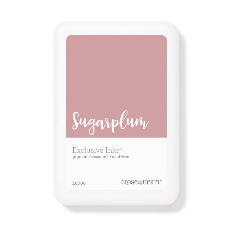
 Then I went for all Sparkle. I replace the cardstock with Sugarplum Glitter paper. On the sentiment and hearts I highlighted them with Shimmer Brushes.


Shimmer Brushes are a great way to add a little more to your project. They are available in a variety of colors, not expensive, and easy to use.


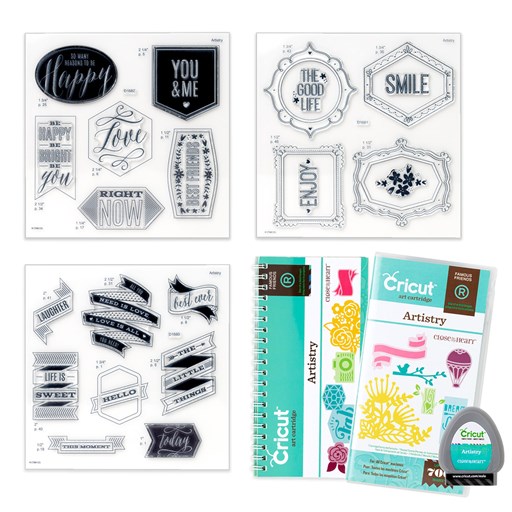
On this sticker from True Love Complements, I accented the diamond with Clear Shimmer Brush.


For the rings on the cut-apart sheet from the paper pack, I also used the Gold Shimmer Brush on the rings.


The Mint Shimmer Brush was perfect to embellishing the glasses of champagne!


For the flowers, I completely covered the pink one with Sugarplum, but only accented the grey shading on the white daisy with the Clear Shimmer.


What is your favorite use for the Shimmer Brush?
Which version of my card do you prefer?
You can post your answer below before following the glitter trail to see what Rebecca has to share.

Colors featured: Sugarplum, Sapphire, Ballerina. Other products used:
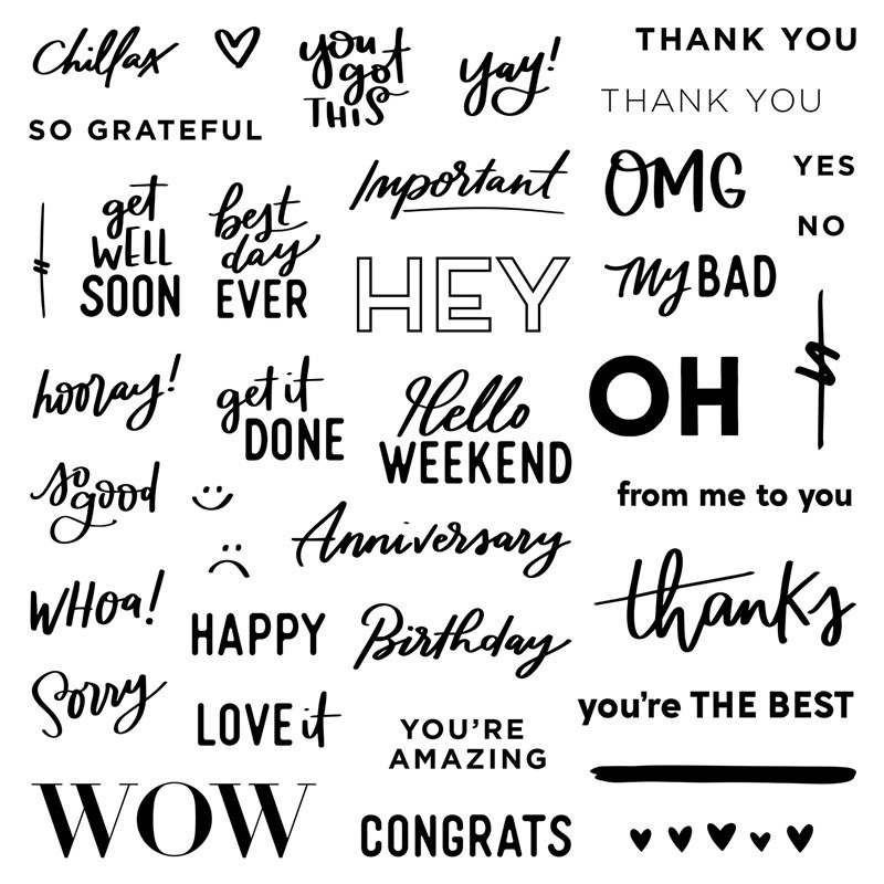
S1908: From Me to You, set of 38Z3298
Sapphire Exclusive Inksâ„¢ Stamp PadSugarplum Exclusive Inksâ„¢ Pigment Pad
VersaMarkâ„¢ Ink PadAnti-static Pouch
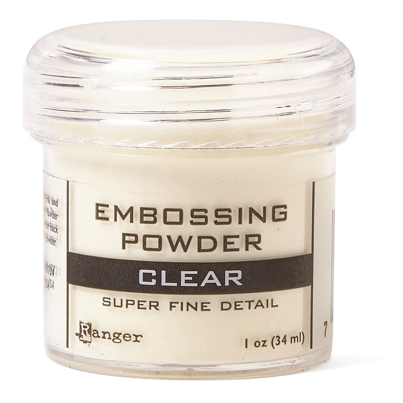
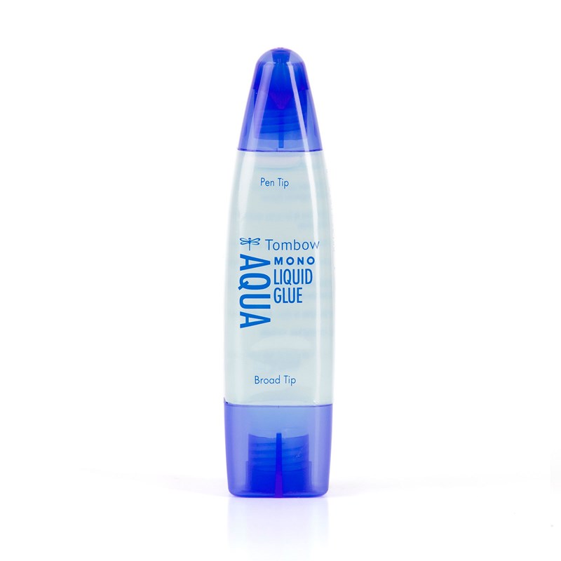
Clear Super Fine Embossing PowderDual-tip Permanent Glue Pen
Glue Dots® Ultra-thin DotsMake It from Your Heart™ Volume 4


Monday, July 22, 2019

Sold Out and Retired List


Here's a link to the retired list. 

This is a list of products from the current Core Catalog that will retire at the end of August. All available items are WHILE SUPPLIES LAST. A few things are already sold out. As more items become unavailable, I will update the list. 


Sometime an items is on the retired list because the packaging is being changed, not necessarily that the product is being discontinued. Sometimes the manufacturer changes, that's also a new item number. If you have a question, or are in a panic, just ask me.

If your list is really long, talk to me about Hosting a Facebook Party or Catalog Show. You can also click above on the Opportunity for You tab and jump in with both feet!

For the two-month long Seasonal Catalogs, products are featured for those two months and many are not intended to be in stock for longer. Stamps are being kept current longer than they initially were. Anything that is available, that is not in the Core Catalog or current Seasonal Catalog, can be found on my website under the Online Only section.

What will sell out first?

Wait a minute while I get my crystal ball...oh right, I don't have one. But, here are my educated guesses (and I've been wrong before!).


  • More than once, demand has exceeded supply and we've surprised the corporate office wizards  who study trends, buying habits, etc. You Are Enough and Stars and Sparklers flew off the shelves the last couple days of June!!
  • Paper collections are promoted in same order as they are in the catalog. They may sell out in the same order. 
  • Items for the retiring colors usually sell out fast as consultants rush to fill existing orders, buy supplies for upcoming workshops, complete collections and get back ups for their favorites.
  • It is easier to control items made "in house" than those we carry from other manufacturers. That is why sometime a product is just gone forever with no warning. When we attempted to re-order from the supplier, they had discontinued the product, or moved on to a new model. Stamp sets are made by CTMH, so if a quantity is low, they make more. 


The following colors are retiring (watch for updates!):


You already know one of the new colors...Mulberry! This was included in the May Special - You Are Enough.

 Any guesses on the new Color of the Year??


Can't find an item on my website? 

                           What do the banners mean?

                                                                            Is it sold out?

  • Back Order/Delayed Shipping
    • More are on the way. 
    • Item may cause order shipping to be delayed (up to 6 days) until it becomes available.
    • We know they'll be here soon so we're going to wait X days and ship everything together.
    • If you don't want to wait, remove the delayed items from your order before submitting. You can always ask me if I have something in stock (especially cardstock).

  • Low Quantity
    • Is is almost gone forever? 
      • current items-not necessarily
      • clearance and going soon items-likely
    • Is it going on back order? 
      • current items- maybe.
      • clearance and going soon items-unlikely
    • Will they be gone in 5 minutes or 5 months? Yes.
      • there might be 100, or 1000
    • ASK ME TO CHECK

  • Out of Stock
    • Is it gone forever?
      • Apparently not. This seems to be code for "be back soon." Example: Sugarplum reinker in the Summer of 2020, I would not have been surprised if it was gone forever, but more stock was coming within a week. 
    • Is it during a Flash Sale?
      • The "quantity set aside for the sale" is probably gone. Look for the item (especially current products) to return to stock (at regular price) after the sale.
    • ASK ME TO CHECK
  • Where did it go?!?!
    • During a flash sale, I had something in my cart, and then it disappeared! Now I can't find it online!! 
      • The item probably sold out. If it is a regular, current item, it will probably be back at regular price after the sale.
      • If it was a retired item, it is probably out of stock and gone forever.
    • It's only 3 weeks into the new catalog and I can't find a new product online.
      • Sometimes it's glitch.
      • I can tell you if the item actually sold out.
      • It may be temporarily unavailable to order. More are coming, but it will be too long to hold on back order. The items is "gone" temporarily until more are back in stock. (Example: the happened with Thin Cuts once)
    • It was in Going Soon or Clearance forever, now it's gone, along with several similar items.
      • They may have been pulled for an upcoming sale. (I saw this before Stamptacular.)
      • They may be gone, especially if they are really old and not selling.
      • It sold out. - These are generally a guess, unless I happen to catch it right after it goes. Retired items don't get placed on the list I receive.


Monday, July 15, 2019

Mix It Up!


Do you love our Mix In paper packs?! These collections are designed to MIX IN and coordinate with every other paper collection in the current Idea Book, or use on their own! Right now, the Mix-In colors are Ballerina pink plus neutral black, white, and grays. One of the things about our B&T (background and texture) Duos that I like is, if one side doesn't suit your taste, turn it over!

If you've arrived from Daryls' page, you're right on track. If you're starting here, follow the link at the bottom to "hop" the next blogger's page. Proceed until you complete the circle and arrive back on my page again.


As life often is, mine is busy and somewhat extra complicated right now, so I'm "cheating" by showing you a piece of artwork I CASEd (Copy And Steal Everything) from the Seasonal Expressions 2 Idea Book. But that's OK, that is the purpose of an IDEA book. But, did you know, the recipes for all the beautiful pieces are available to you?

On your consultant's website site, go to "More" and select "View Catalog." Then scroll down to the pdf link for Recipes. All the ingredients are listed including colors, stamp(s) and tools used. If Cricut shapes were used, the recipe will list the collection name, size, shapes name and DS code.

 Here's the recipe for this card:

PAGE 82
4¼" x 5½" Happy Birthday Card (Horizontal)

A1228 My Acrylix® Special Day Duo Stamps
X9005 Mix-in Paper Packet
X6028 Black Cardstock
X5988 Peach Cardstock
X6018 Raspberry Cardstock
X6022 Smoothie Cardstock
Z891 VersaMark™ Ink Pad
Z4057 Craft On Rubber Shapes
Z4213 Silver Embellishing Thread
Z2068 Ranger™ White Super Fine Emb Powder
Z4220 Anti-static Pouch
Z4252 Heat Tool
1772 Glue Dots® Ultra-thin Dots

Guess what? The ONLY piece of Mix-Ins I have used to date is the one featured in the catalog. Could I just substitute that one piece? Me?? No! Any normal person? Yes!!


So if I was going to substitute for the B&T I might as well substitute the cardstock too. The colors used in the sample seemed a rather odd combination. By looking at the CTMH Color Wheel, I was able to determine the "formula:" one color from one section, skip a section, two colors from the following section. I'm sure there is a fancy name for this arrangement, comment below if you know it!!
My colors are:

Emerald from the green section
(skip the Blue-Green section)
Carolina and Bluebird from the Blue Section

Oh look, I picked blue and green!! Totally unplanned but probably done unconsciously; they're my favorite color combo!!

I had to decide which color was going to go where. That's hard!! When I was cutting the B&T from Mix-Ins, I made it a 4" x 5.5" rectangle. I know that I can get three piece across a 12" piece, and as long as I was making one card, I might as well make three. Then I cut each of the other three shapes from each of the other three colors and mixed them. This pattern is similar to, or a variation of , #16 from Make It From The Heart, Volume 4 (MIFTHV4#16).

Instead of the Craft On Rubber Shapes, I used Black & White dots. (On one card I used some retired Emerald dots from the Cats & Bats collection.

Have you ever heat embossed? Has it been forever?? We all love this technique so I'm not sure why we don't use it more often. If it really has been a while, check out what Close To My Heart offers now including a new heat tool, tinsel embossing power, and an anti-static pouch.

The pouch is great for keeping stray embossing power off your paper so that it only sticks to the ink. I also use it on the back of stickers when using them as die cuts. The powder inside the bag sticks to the sticker adhesive so it's not sticky. It's much faster, simpler and easier than using baby powder. The pouch also tames your lose sequins. Just throw it in the bag when they're new and give it a little shake. Remove the pouch and your sequins will stop doing their Mexican Jumping Beam imitation.

Another item I think is a must have for heat embossing is the All-Purpose Mat. The large size protects your craft space. It is also double sided. The smooth, shinny side is a non-stick surface. Keep your adhesive off the back of your project! You can also use it as a palette for watercolor projects and mixing ink colors. The other side is slightly tacky, which keeps it from sliding on your work surface. If you turn this tacky side up, it keeps embossing powder for dusting everything in the craft room. You can wipe or wash it off as needed. It is also heat resistant to  240° Fahrenheit.

Making all three sentiment squares the same would have been too easy. I used three combinations so you could see the difference. The photo on the left lists the ink underneath the piece and the embossing powder color above it.


At the far right is the combination from the recipe: Ranger™ White Super Fine Embossing Powder and VersaMark™ Ink Pad. In the center is the same powder over white pigment ink. And, the far left is white pigment ink with clear embossing powder.

What is your favorite color arrangement? Which embossing combination would you use? Answer in the comment section before  hopping over and see what Melissa has to share. (She also has a list of all the participants this month.)

These are the other products used, instead of or in addition to the recipe listed above:

X5990 Carolina Cardstock
X5987 Bluebird Cardstock
X6001 Emerald Cardstock
Z2045 All Purpose Mat
Z2863 White Pigment Ink
Z2088 Clear embossing powder
9044  Make It from Your Heart Volume 4
Z3314 Black & White Dots