
Join us in our monthly Technique Blog Hop during the Season to Sparkle! Go from blog to blog by following the links to see all the shiny art we have to share...
You've arrived from
Alyson Mayo's blog. If you get lost, Rudolph will light the way (or you can find a list on Melissa's blog).

This theme was hard for me because it's more along the creativity line, which is NOT my forte! At first, I wanted to use EVERY sparkly, shiny, glittery product we have; but I was able to refrain myself.
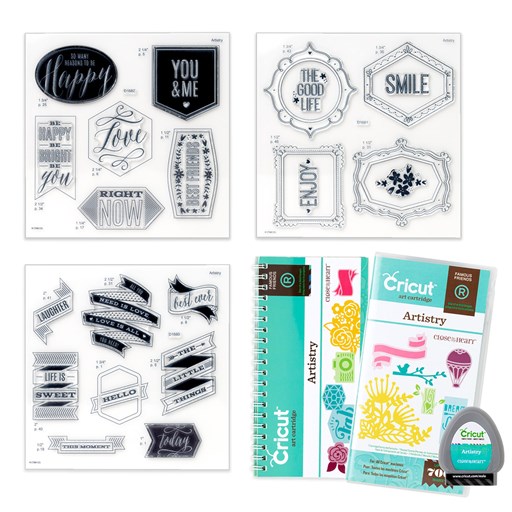
I looked at some of our fabulous How To books then I went to the CTMH Cricut Collections. Now that ALL of them are available to purchase, I had thousands of image choices! So, which collection claims this image? One of the limited edition Christmas selections? No. A card from Artfully Sent? Nope. It's actually a page from Artbooking!!

I selected our White Glitter Paper for this layer. If you haven't tried it, there's no problem cutting it on the Cricut. I leave my machine on cardstock and use a standard mat, but not a new mat; it's like White Daisy Cardstock. If you cut a lot of glitter paper at one time, clean out your blade housing. I noticed this a few years ago when I cut pages of snowflakes.
 I must have been making too many shaker cards lately because that's what I saw with the "window" in this image. I hid the holes in the page with the contour tool in design space. I had planned to mount the image on a card base so I sized it 1/4" smaller. But I didn't like the fancy corners on top of the square corners. I looked for a card shape to coordinate but didn't find one, so, I made one! I resized the image to card front size, duplicated the image, hid the window contours, and welded two together.
When I was picking out the sequin colors I kept going back and forth between silver and gold. I couldn't decide on a base color with either of these and the White Glitter Paper, so I added a backing to the window with Silver Foil Paper.

My card is finished off with White & Gold Skinny Ribbon. I decided to add it after the card was assembled so I used my ribbon trick: Whenever I want to save ribbon or when I need ribbon tied about a piece of paper, I tie it around a My Acrylix block first. That gives me a firm object to work with and I can snip the loop off center if the bow isn't going to be in the middle. I suggest using a block that's about twice the size of the paper (this was actually too big, but the one I had nearby). Keep the other end attached to the roll until you're finished also helps when making bows or tying knots.
Thanks for stopping by!!
Please leave a comment before you hop to Katy Taylor's blog.
Products Used:
- White Glitter Paper
- Silver Foil Paper
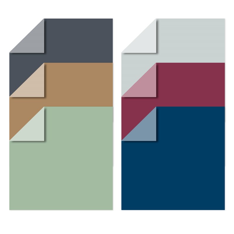
- Sapphire Cardstock
- 3-D Foam tape
- Gold Sequins
- White and Gold Skinny Ribbon
- CTMH Artbooking Collection
- Anti-Static Pouch
- acetate or similar


