Showing posts with label color. Show all posts

Thursday, April 15, 2021

Dazzling Dimension - CTMH Technique Blog Hop


Welcome to The Scrap Buzz and this month's edition of the Technique Blog Hop. You have arrived from Miss Carrie's page. Keep following the links to visit all of the participants as we Show You How to add Dazzling Dimension to your projects.

When I think of dimension, I think of layers. I chose to use the Layered Flower Background Thin Cuts. These have been in my stash for a while but I hadn't gotten around to playing with them. All three dies come together.

These dies are so well designed it makes "fancy" cards Faster, Simpler, and Easier to make! The hardest thing is deciding which paper(s) to use. To select my colors, I turned to our fabulous Love of Color books. In Volume 2 I found the combination of Sangria, Peacock and Linen. In Volume 1 I found Sundance, Desert Rose, Peacock and Peach. Then I consulted the color wheel and found Sangria, Peacock and Sundance formed a triangle; they are a triadic color combination.

Do you save ridiculously small scraps??  I saved the dots and the largest leaves and made a little flower on the inside of my card. I know I tossed quite a few tiny pieces and Cricut negatives when we moved last summer, so I figured I could start a new collection! The dots might be nice in shaker cards. I used a sentiment from the Operation Smile set called Every Bit of Wonderful.


To give my card extra dimension, I cut the three layers again out of some retired paper. When assembling, I attached the two identical layers first, then attached them to the card base, bottom to top. Does it look like there is much difference? FYI I weighed my card and it is still until the 1 ounce for first class letter postage in the US.


I had to try another color combination. This time I pulled three colors from the Lovely collection: Blue Belle, Sage, and Ballerina. I cut two 4.5x12 pieces from each 12x12 sheet so I could make four cards. When cutting the bottom two layers I didn't have any trouble and was able to get both dies on the CTMH cutting mat at the same time. I did not try to cut multiple layers, just because I was mixing colors. When doing the top layer I found it worked best if I cut it alone and it needed more pressure than I usually use. I set my CTMH die cutting machine to +1 and ran it through two times. The next time I make one of these, I’ll check it after one pass. TIP:  I learned with my old Cuttlebug to place large straight dies at an angle so the transition isn’t as severe. 


Another way to use this die is to cut all the layers out of the same color. Since I cut each color with all three dies, here’s what that might look like (the layers aren’t attached). I flipped every other layer so it showcases our two-tone cardstock. For these I also added a solid layer but the other cards are built on the white card base. This might be a great way to use up old colored card bases or 8.5 x 11 cardstock!


The first card I assembled I tried one of the liquid tombow glues. I thought I would need "wiggle" room. But the CTMH Adhesive Runner worked better. Don’t forget to work on top of the All-Purpose Mat. I put the top two layers side by side and ran the adhesive along both edges at once. If you have any way-ward dots, use the Rub and Remove Eraser to remove them.


Your next stop is Melissa Robinson. She also has a list of all participants in case you get lost.


Friday, May 15, 2020

Stencil It! CTMH Technique Blog Hop


Welcome to our May blog hop! You've come from the blog of Hayley DyerTo continue the Hop, just follow the links from blog to blog until you get back to where you started. If you get lost, you can find a list of participants on Melissa's page. This month we are highlighting stencils. That may sound old school to you, but I'm sure you'll find new ideas for personalizing your art work! Before showing you my project, I have an announcement to make:

...And the award for the Official stamp set of the Pacific Northwest 
goes to..."Make a Splash!!" {Applause}

Make a Splash
I knew I needed this set as soon as I saw it in the May/June catalog. It is pretty adorable even if you don't live in a rain forest. Don't you think?? Plus the sayings are appropriate for almost anyone, anytime and I was surprised by how perfect the set is for these crazy pandemic times. If you need more rainy weather stamps, check out "When Skies Are Grey."

I wanted to showcase this set and was also inspired by the Blue Skies cardstock, part of May's special for National Scrapbooking Month. I love the UV coating and wanted to make something similar. 

Can you see the raindrops? 
This card pattern is #7 in Make It From Your Heart Volume #4. I always think rain boots are yellow; too much Curious George as a child I guess! I paired it with one of the papers in Stitched Together. Do you see anything stitched or quilt-related in this design? That's what I love about our B&T Duos and paper packs: any pattern that highly themed is usually universal on the reverse side. Can you see the upside-down raindrops on this paper?? I think they're supposed to be flower petals. That would be something else I could do with my stencil!


Here's how I made my card:  The rain drops are from an overlay image in the Cricut Artistry Collection.  In Design Space, I added the image then used [Contour] to hide the outer line of the image; this gave me just drops to cut out. I used [Duplicate] to copy the image, next I used [Contour] again to "remove" a few drops at the bottom. I made a copy of the edited image with [Duplicate]. Now I had three images, the original, and two edited copies. I lined these up by utilizing the [Position] coordinates. Finally, all three images were "connected" with [Attach] to cut as one item. When cutting the stencil, I made sure to move it over so that there was at least 1" around all three sides when finished.

Before putting the raindrops on my paper, I stamped the two sentiments in Sapphire ink. I rubbed the Anti-Static pouch over this piece and then tacked it in place on a piece of desk pad paper. The stencil was positioned over the cardstock. The drops are fewer near the bottom so I kept away from "splash" but went right over the sentiment at the top. I used the VersaMark pad right on the stencil. After removing the stencil, I used clear embossing powder and embossed as usual. 


Note: Your stencil will be sticky from the VersaMark ink. I first tried cleaning it off with Spritz and a rag.That wasn't bad, but I had so many layers from experimenting, it wasn't quite enough. On my way to the sink, I passed some baby wipes. The wipes worked, at least with my pre-wash. I wouldn't use the chemical disinfectant wipes everyone is hoarding right now, but alcohol-free, mild baby wipes may work. Otherwise, go with my first thought, clean it with a mild soap and water.


To make the puddle at the bottom, I grabbed my Mint Shimmer Brush.


Inside, is another boot, this time stamped with Mink instead of Black so the image is defined, but not overwhelming the sentiment. These could have been stamped right on the card base, but I wanted the flowers to be a separate piece so that the marker didn't show through the back. 


Now, I would never have fussy cut these flowers out of the paper. Even cutting out the boots would have been pushing it, and those are a much simpler design. But with Thin Cuts, it was no problem! It's one of the main reason I bought this stamp set, I can use these flowers for many other projects. The flowers are colored with Tri-Blend markers. 
*I've since decided that Green Turquoise (light end) is a better match for Mint. I'd call the Dull Green colors > Green Apple (light), Sage, and New England Ivy (light). For Sweet Leaf I like Citrus Green (light end). Those of us in the matchy-matchy OCD world can get really freaked out about color matching! But, the truth is, on these tiny images, none of which are even shown with the patterned paper, it doesn't matter (too much!).

Please leave some love in the comment section below!


Thanks for stopping by!! Next, head over to see what fabulous-ness Maz Wood has for you this month.

🛒🛒Ready to shop? Head to my website to find the products I used:

  • Make a Splash stamp set (available with or without Thin Cuts)
  • Stitched Together paper pack (available with or without sticker sheet)
  • Lemonade Cardstock
  • White Daisy Cardstock
  • Mint Shimmer Brush
  • Intense Black ink pad
  • Sapphire ink pad
  • Mink ink pad
  • Tri-Blend markers (see colors above)
  • VersaMark pad
  • Anti-Static Pouch
  • Clear Super Fine embossing powder
  • Heat Tool
  • Stencil Sheets
  • Card Bases and Envelopes value pack
  • Artistry Cricut Collection (use this link to shop Cricut)


Saturday, February 15, 2020

Color Your World - Technique Blog Hop


Thank you for joining us in our monthly Technique Blog Hop. For February, we're going to "Color Your World." Go from blog to blog by following the links to see all the coloring ideas we have to share. 

If you've arrived from visiting Darlys Recker, you're in the right place. If you get lost, you can find a list on Melissa's blog. 


I think when we talk about "coloring" most people have images of pencils and markers (or crayons), but there are many other ways to use color in your art that don't require "staying in between the lines." First is a technique we call paper piecing. Instead of coloring part of an image, you stamp the image twice, once on plain paper, and a second time on a print or coordinating color. Here I used the crazy lady from "You're Not Old" and cut her skirt from the plaid paper in Celebrate Today paper pack.  (Don't forget, this month during Stampaganza you can save up to 50% on stamps or stamp/thin cut bundles!)


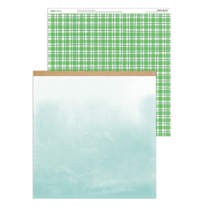
I love that our paper packets sometime include sheets that are a piece of artwork in themselves. Here is one from the Nov/Dec Mix In pack that looks like a watercolored sky.
Mix-in Paper Packet

There are several watercolor patterns in the Celebrate Today paper pack too: one is an all-over monotone look and the other is a background sheet with several rainbow colors.


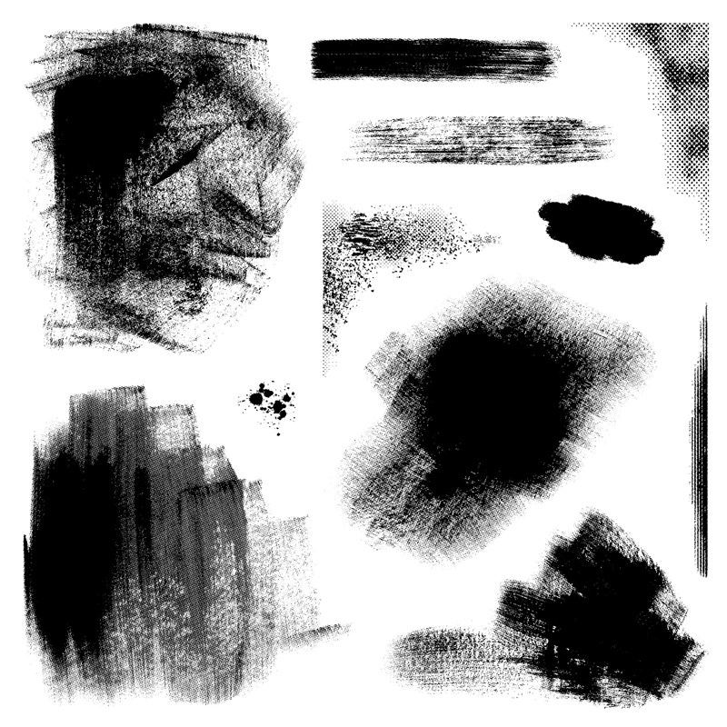
Another way to faux watercolor is with the "Strokes of an Artist" stamp set. Using a regular ink pad, you can stamp texture that looks like it was painted.
Strokes of an Artist

The Cardmaking Workshop Kit for Celebrate Today teaches a number of methods to add color without actually "coloring" in traditional ways. These include: using watercolor paints, stamp rolling, tone on tone stamping, and stamping on colored cardstock.


If your stamp is relatively symmetrical, you can use the wrong (flat) side to "color" then add the detail with the regular (bumpy) side. 


I hope this post gave you some "out of the box" ideas for coloring! Please leave a comment before hopping on to see what Lauren has to share.

Friday, November 15, 2019

Paper-Layering


Welcome once again to our monthly Technique Blog Hop. You may have arrived from 
Cat Scrapbooking. Be sure to check out all the posts by hopping to the next blogger until you get back to where you started. I'm sure you'll be inspired by the creativity, amazed by the artwork and/or learn something new.

If you get lost, a list of participants can be found here.


This month we are focusing on Paper Layering. This made me think of Cricut project with our fabulous collections. Did you know...ALL of the CTMH Collections are available for purchase?! This includes the two Christmas Collections:  City Sidewalks and Season of Joy.


I selection our newest collection, Complete Creativity, for my sample. I picked an 8.5x11 single page layout and adapted it to make a standard size card. Even though I know the math, it is easy to forget that the two sizes are in the same proportions. That means when you shrink an 8.5x11 down to 4.25x5.5, it's the same, just smaller!

There were a few elements of the layout I didn't need for a card, so I hid the photo mats and journaling boxes. I also switched the red to green and then swapped the bottom layer that appears as borders with the top mat layer.


Is is hard for you to image artwork in different colors?? It is for me! I selected the color palette from one of our new Paper Suites, Cedar and Pine. Did you know that the color swatches are in the catalog? I always find them helpful.


Here are the layers of the card when I assembled them. The very bottom is a blank card base. The trees are also layered! They cut as half circles and then are folded accordion style. These look great with our Two-Tone Cardstock!


After WAAAYYYY too many attempts to cut the sentiment in various sizes, I decided the best idea was to stamp the front of the card. (The part that says "tis the" is very fine.)  Ink can be a layer too!!

I actually found a stamp with a similar style! It's from the Holly Jolly - Cardmaking set.


I finished the card by accenting the stars with the Gold Shimmer Brush.  I wonder if I could make a layout from a card?? Do you re-size things in Design Space? Give it a try! Here is my DS file in case you're in a hurry.


One more word about the Close To My Heart Cricut products:  When shopping, always use your consultant's LINK to go to the Cricut web page. This is the ONLY way to find Complete Creativity. To find their link scroll all the way to the bottom of their web page where you'll find icons for various social media platforms. Click on the little green "C" square. If you don't have a consultant, I'd be happy to help you!

Please leave a comment below before checking out what Michelle Loncar has to share.