Showing posts with label stamping. Show all posts
Wednesday, March 1, 2023
March Madness!
Apparently, some people think this month is all about an orange ball, but I have better ideas!! First off, CTMH has given us a STAMPTACULAR special this month. My Acrylix are 35% off and Stamp + Thin Cut sets are up to 60% off!
In addition to the currently available stamps, there are five new sets created just for this special, and they are also discounted! Even better, when you purchase the bundle of all five sets, you save 50%!
For even more Madness this month, I will be featuring a series of masking tips on my Tuesday Facebook posts so be sure to follow me there!
If Masking is new to you, check out this video. Masking is the last technique of the three featured.
BONUS!! The stamps featured in this video are all in the Stamptacular Sale!
Z3930 Sweet Fruit Stamp + Thin Cuts is about 25% off.
Z3764 Florals & Flutters Stamp + Thin Cuts is over 40% off.
Z3765 So Happy Together Stamp + Thin Cuts is over 40% off.
Tuesday, February 15, 2022
Stunning Stencils - CTMH Technique Blog Hop
Whether you arrived from CatScrapbooking or just stumbled upon us, WELCOME to TheScrapBuzz blog and this month's Technique Hop. We are using stencils for February; there are several new ones in the Core Catalog. Follow the links to hop from blog to blog for techniques, tips, and artwork!
If you get lost, find broken links or have other issues, you can find a list of all this month's participants on Melissa's page. We have over a dozen CTMH Makers participating this time! Be sure you are commenting so they know you appreciate their efforts and continue to share their projects!
I spend several days of quality time with one of three new Card Front Stencils, Pack #3.
Did you see this post on the Make It From Your Heart blog? I was having trouble with the diagonal stencil until I watched this video from that post. One thing I'll suggest is when you are sponging with our Exclusive Inks, is to use the corners of the stamp pad. We usually ink stamps in the middle of the pad. Whenever I use small stamps, or sponges, I try to use the corners. As you'll see in Karen's video, press the sponge into the pad to absorb in, then pounce the sponge when the stencil wants to "wiggle."
I made my own background paper with the diagonal lines then featured it with Pattern #18, from Volume #4 of Make It From Your Heart.
In between the lines, I stamped the little bee from the Sweet As Honey - Cardmaking stamp set.
After you leave a comment, hop over to see what Wendy has created this time. Thank you for stopping by!
Products Used:
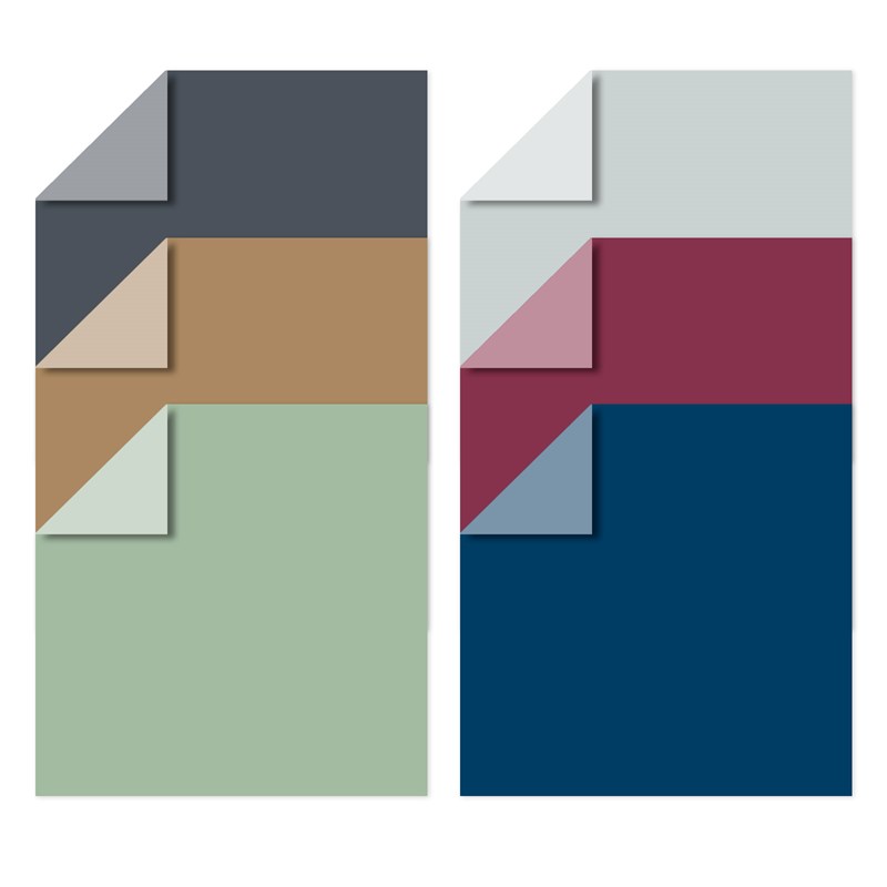
Cardstock: Black, Shortbread, Sundance, Mink
Exclusive Inks: Black, Sundance
Sweet as Honey paper pack
Stamp Set: Sweet as Honey - Cardmaking
Tuesday, November 2, 2021
20 Years as a Maker
If you missed the email, here's the info on my anniversary give-aways:
November marks my 20th year as a Close To My Heart Maker/Consultant and I sending YOU the presents! After all, if it wasn't for all of you: shopping, cropping, booking, and sharing, I wouldn't be in business. I will be entering people into drawings for random prizes. How are you entered? Let me count the ways!
- Do something...comment, like, follow, share on social media. For my vanity? No. Because that's how Social Media works. Algorithms and other techie stuff. You can find links to the right (on web page). I'm also uploading and sharing my videos. I made a new page on my blog where your can find my previous classes and links for the CTMH workshops. If you're on a new platform such as: Locals, Mewe, Gab, Rumble or Parler, let me know.
- bonus "tickets" for finding "errors" on my blog
- Shop. That's always appreciated! Look for Black Friday and Cyber Monday sales and announcements later this month. The new November/December catalog just started and the new Core Catalog is only a few months old. FYI there were a LOT of items that sold out from September/October. In a few days we'll know if there is anything left (paper, thin cuts, embellishments). You should be able to find September/October stamps in the Online Only section; they are around for about a year. I'm giving out prize drawing "tickets" for almost anything that involves "20" or "anniversary."
- every $20 spent
- items from page 20
- item numbers that include "20"
- stamp sets that include the word "anniversary"
- November/calendar products
- Stamp of the Month
- Join. Sign-up, renew, and/or refer a VIP. There are also TWO special products exclusively for VIP members! Don't forget my Stamp and Scrap Club and Create with Heart subscriptions!
- Donate $20 to Operation Smile. You can go through my website, no shipping, etc. It's only $240/child for surgery that will change, if not save, their life. Can we raise enough for one smile??
This "special" runs through November 30, 2021.
Sunday, August 15, 2021
Anything Goes - CTMH Technique Blog Hop
Welcome to The Scrap Buzz! For this month’s Technique Blog Hop…Anything Goes! If you’ve arrived from visiting Lauren Moore, you’re on the right track! If you get lost or find any broken links, a full list of participants is on Melissa Robinson blog.
I was having trouble coming up with a card, or smaller project, so I decided to make a Scrapbooking layout using Wander Paper Pack and Sticker Sheet. Our youngest son and his fiancé are off on another hiking/back packing adventure this weekend so there are always outdoor pictures to scrap.
The layout is Design #11 from our newest How To book, Make It From Your Heart, Volume 5. Similar to Volumes 1 and 2, this book contains designs for both layouts AND cards. The construction on Volume 5 is identical to that of Volume 3 and 4: heavy-weight, coated pages with holes so you can place it in one of our 6x8 Everyday Life albums. (Note: Volume 2 is almost sold out. I don’t know if it will be re-printed or re-published.)
The Sundance pieces at the bottom are zip strips. I used up some of my remaining stickers and also had some left-over Wander Die-Cuts to use. Did You Know…these are printed, perforated chip board pieces and the designers really did a great job filling in all the spaces with frame and shapes.
Some of my embellishments are images that I stamped with the Take A Hike stamp set. It is also available with Thin Cuts. This is a fun outdoor themed set that I’m sure I’ll be using over and over with several paper suites! I used multiple techniques on these pieces. The paprika backpack is my attempt at copying the haphazard way the pattern paper is colored. I used a water brush and ink from the lid of my Paprika stamp pad to make a colored, oval blob on White Daisy Cardstock. Then, I stamped the backpack image on top using Black EI ink.
The blue back pack and water bottle were stamped with Sapphire EI Ink on Glacier cardstock. The green water bottle was stamped in Sage using the BACK of the stamp. This makes a solid image. Then I stamped it normally using Evergreen EI ink. This is a great way to “color” outline stamps that are left and right symmetrical, or very close. Flower stamps are fun even if they aren’t perfectly matched because you get that haphazard coloring look that this paper suite features.
I also brought in the current Mix In papers. These are truly one of my favorite products because of their versatility. Not only do they stand alone, but also coordinate with the two paper suites in the bi-monthly catalog they share. Don’t over look these from other catalogs if they are still available! And, if you see them on a flash sale, snap them up!! There are six double sided sheets per pack (12 patterns), which is a nice sample size, or grab two acts so you have two matching sheets for layouts, or one full sheet to use of each pattern.
For my title, I used a 4x6 Wander PML Card but it was too tall for the layout design…I could have adapted the page, but I adapted the card instead. I cut a piece of Peacock Cardstock the size specified in the design. Then, I trimmed the card a bit so the cardstock would show as a thin border. I love the two lines of stitching and didn’t want to just trim the PML shorter. By cutting the card where the colors change, I could layer the two pieces to make it look like one card. The white space is a good place to add the date and location for the adventure pictures that will be added.
I also did some paper piecing, by stamping the same image in several colors, then fussy cutting the images and reassembling some of the shape together for one embellishment.
Thanks for stopping by; please leave a comment below. Next, hop over to see what Katy Taylor is sharing this month.
Monday, February 15, 2021
It's Faux - Technique Blog Hop
Welcome to the February 2021 Technique Blog Hop! If you get lost, or find a broken link, you can get the list of participants on Melissa's page (which also happens to be your next stop). You may have arrived from Haley's blog. Complete the hop by following the links from blog to blog so you don't miss any of the artwork.
This month we are featuring faux techniques. Yes, I did look it up via Webster's online, so if you didn't know...
\ ˈfō \
Definition of faux
Plus, faux sounds much nicer than fake. Don't you agree?
I was playing around with scraps and thinking about this months blog hop. (I was inspired by a card by former CTMH Consultant Laurel Seabrook.) Somewhere in between “that works” and “which technique should I do?” it occurred to me that several Faux techniques can be done with the February Stamp Of The Month, Doodled Borders.
Here’s my card:
How many Faux techniques can you name? After I see what amazing things the other consultants share, I’ll come back and note if there are techniques on my cards that no one mentioned. By the way, the gingham border is designed as a border, so you'll need to mask if you want to make it taller, vs. wider. So after making four 1x1 squares and throwing out more than four, I switched to a different stamp. I also played with moving the colors.
One of the 36 stamps in Doodled Borders (faux doodling!!) is a short dashed or stitched line. It may be Faster, Simpler and Easier to use a longer stamp such as the one in Counting My Blessings. However, here are some ideas for keeping this shorter stamp lined up when stamping across a larger area:
1. Start in the middle. This is a good tip for letter stamping too! If you start at one end, you tend to go up or down as you move across the paper. Starting in the middle gives you a chance to start over when you finish one side.
2. Use the line. See that little line on the block? Every Close To My Heart My Acrylix Block has that line. It’s great for getting stamps onto you block straight, or to line up letters. But I often use it as a guide for where to stamp. By lining up your stamp just a bit away from the line, you can match the line to the edge or your paper which will give you even spacing. Look straight down through the clear block. Placing your paper on a VersaMat not only provides a cushion for stamping, but also makes it easy to see the edge of a white card base.
Side Note: Be sure to wipe your VersaMat off with the Stamp Shammy if you stamp anything off the edge, or you'll get extra "embellishments" on the back of your card, or sometimes the inside [gasp!].
3. Use a ruler. Place a ruler on your project as if you were going to draw a guide line (yet another option). Line up you stamp next to the ruler, right on your imaginary line.
Here's one of the final card bases:
On some of the first cards I made, I didn't worry much about how straight the elements were; I was going for a scrappy quilt look. If you want to see the original cards I was making, you can find them on Pinterest. I had a bunch of leftover pieces from using the Heart Background and Multi-Square Windows Thin Cuts dies. How do you use your scraps? Usually I wait and see if I have a need for the specific size & color but this time I went backwards to see what I could make with the leftovers. It was also one of those times when a messy desk lead to ideas, Doodled Borders happened to be nearby.
Thanks for stopping by! If you need supplies, check out my website. Please leave a comment then head to Melissa's page.
UPDATE: Here are the faux techniques on my card:
- faux stitching (Did you realize how many ways this can be done?)
- faux printed paper
- faux embossing
- faux washi tape
- and maybe faux doodling if you count the stamp set! ;-)
Sunday, November 1, 2020
Here's the deal...
How does the Stamp of the Month program work?
Every month there is an exclusive D-size stamp set that is available to purchase ONLY during its featured month. There are never any "left overs" that you might see like after a seasonal idea book retires. They don't show up in the clearance section. If you want that stamp set, it must be purchased between the 1st and last day of the month in which it is offered.
The retail price of a D-size stamp set is $18.95. It is always available to anyone at full price; but, HERE'S THE DEAL:
When your retail total is $50 or higher, you can purchase the SOTM for only $5!!
That's pretty good! Do you want better?? VIP Customers can get the SOTM for FREE when their total is $50 or more. The best news is that VIP customers can get this deal EVERY month!! That's over a 25% savings (on a $50 order) BEFORE any other VIP perks.
Want two? If you want a second SOTM for a friend, or to have double the letters of an alphabet, etc., additional sets are $5 each for every additional $50 retail spent.
Saturday, February 15, 2020
Color Your World - Technique Blog Hop

Thank you for joining us in our monthly Technique Blog Hop. For February, we're going to "Color Your World." Go from blog to blog by following the links to see all the coloring ideas we have to share.
If you've arrived from visiting Darlys Recker, you're in the right place. If you get lost, you can find a list on Melissa's blog.
I think when we talk about "coloring" most people have images of pencils and markers (or crayons), but there are many other ways to use color in your art that don't require "staying in between the lines." First is a technique we call paper piecing. Instead of coloring part of an image, you stamp the image twice, once on plain paper, and a second time on a print or coordinating color. Here I used the crazy lady from "You're Not Old" and cut her skirt from the plaid paper in Celebrate Today paper pack. (Don't forget, this month during Stampaganza you can save up to 50% on stamps or stamp/thin cut bundles!)
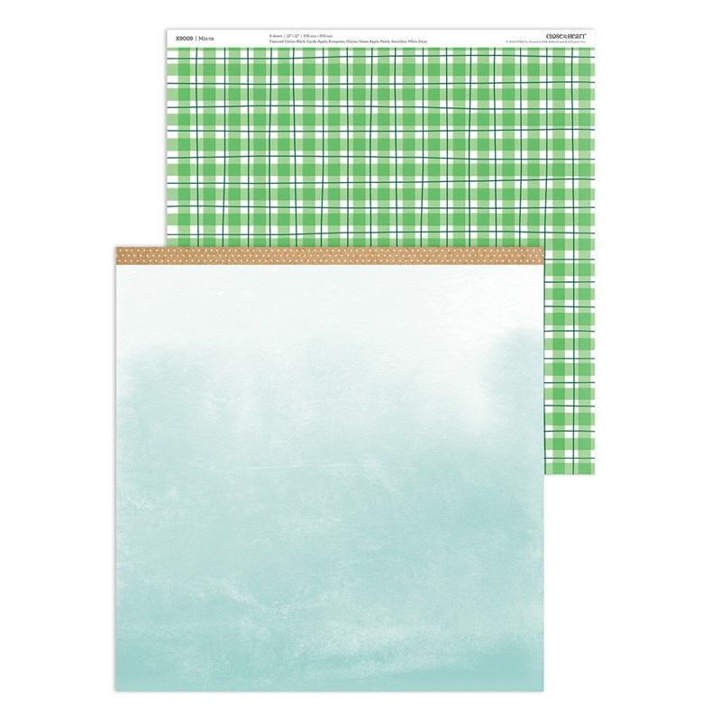
I love that our paper packets sometime include sheets that are a piece of artwork in themselves. Here is one from the Nov/Dec Mix In pack that looks like a watercolored sky.
There are several watercolor patterns in the Celebrate Today paper pack too: one is an all-over monotone look and the other is a background sheet with several rainbow colors.
Another way to faux watercolor is with the "Strokes of an Artist" stamp set. Using a regular ink pad, you can stamp texture that looks like it was painted.

The Cardmaking Workshop Kit for Celebrate Today teaches a number of methods to add color without actually "coloring" in traditional ways. These include: using watercolor paints, stamp rolling, tone on tone stamping, and stamping on colored cardstock.
If your stamp is relatively symmetrical, you can use the wrong (flat) side to "color" then add the detail with the regular (bumpy) side.
I hope this post gave you some "out of the box" ideas for coloring! Please leave a comment before hopping on to see what Lauren has to share.
Tuesday, October 15, 2019
Back to the Basics
Sometimes, we get so obsessed with new that we forget the tried and true. This month, we're going Back to the Basics to remind ourselves that these techniques are timeless options for stamping and scrapbooking.

If you've arrived from Michelle's blog, you're in the right place! If you just happened to stumble in, welcome to The Scrap Buzz! My posts tend to be long, because I want to share ALL the details!
To view all the posts in this month's blog hop, follow the link in each post to the next blog until you arrive back where you started. If you get lost, or run across a broken link, you can find the complete list of participants on Melissa's blog.
Let's review RANDOM STAMPING. This technique can be used to create your own Background & Texture (B&T) paper. It is my favorite for scrapbooking sports because I can customize my paper every year using a few stamps and the team colors.
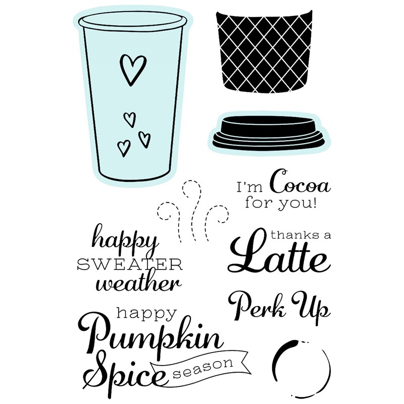
To begin, stamp two images, then stamp a third to form the points of a triangle. The distance between images will depends on the size of the stamp, what else you plan to add, and the size of your paper. The stamp I used was the coffee ring from the Perk Up stamp set. After making one triangle, use two of the previously stamped images and add a fourth to form another triangle. Repeat until you are happy with the result and/or fill up the paper. If you are using more than one stamp image, start with the largest then go back and fill in using the smallest image last.
For my project, I chose the Hawthorn paper pack and selected ink colors to match. Did you know these colors are listed
- on my website with the paper
- in the catalog at the beginning of each paper suite
- on the last page of the recipe booklet
- on the zip strip for each B&T paper.
I found some pumpkin spice lip balm and had to make a fun card with Perk Up! I selected the leave/green print paper to be the base of the card. On the front, I added a piece of Sage cardstock, light side up, to coordinate with the Hawthorn paper. My first ink color was Toffee. Notice that I didn't make the triangles very even. The point of random stamping this paper was to add some texture. I focused on two opposite corners and made one "heavier" than the other. Next, I used our new Paprika ink. At this point I needed more so I stamped another round with the same color. These three images form their own triangle but they also form triangles with the three previous Paprika images. Notice too that I am overlapping my images this time. Sometime this works, it depends on the stamps.
Finally, I stamped two sets of rings in Pebble; you can barely see them. To keep the upper corner heavier, I stamped more of the rings on the paper. In the bottom corner, the more of the ring images go off the paper. Always stamp some of the images off the edge or your paper when random stamping. It helps the visual and prevents a trapped or framed look.
After stamping a few sets of ring images, I laid the elements of my card in place to see if more rings were needed.Tip: When using the Versamat as your stamping surface, either lay a piece of scrap paper over it, or clean if off when your done. I love that the Stamp Shammy is perfect for this!! If you don't wipe the ink off the Versamat, you may lay something down and pick up the ink where you don't want it.

Here is my finished card! Our B&T duos are just perfect for cards like this when both sides of the paper show. On the outside of the card, I used the October Stamp of the Month, Autumn Air. "Fall" is embossed with Princess Gold powder. "Is in the air" is stamped in Charcoal ink. I made sure to leave room in this area while I was random stamping. The inside sentiment from Perk Up is stamped in Paprika.

This fancy fold design came from a make up sample I received. I copied the design and adjusted the size. I did several of these a few years ago, measuring and scoring each card individually. This time, I made a Cricut DS file. If you would like to try this card, you can use my file for FREE!

Next, hop over to see what Amy has created.
If you're ready to shop, and don't have a consultant, you can find these products on my website.
Note: There are thin cuts for Perk Up, but they are currently unavailable. More are scheduled to arrive soon!
Products Used:
Perk Up stamp set & thin cuts
Autumn Air - October SOTM
PebbleCharcoal
Versamat
All-Purpose Mat
Stamp Shammy
Princess Gold embossing powder
Anti-Static Pouch
Versamark ink
Heat Tool
Monday, July 15, 2019
Mix It Up!
Do you love our Mix In paper packs?! These collections are designed to MIX IN and coordinate with every other paper collection in the current Idea Book, or use on their own! Right now, the Mix-In colors are Ballerina pink plus neutral black, white, and grays. One of the things about our B&T (background and texture) Duos that I like is, if one side doesn't suit your taste, turn it over!
If you've arrived from Daryls' page, you're right on track. If you're starting here, follow the link at the bottom to "hop" the next blogger's page. Proceed until you complete the circle and arrive back on my page again.
As life often is, mine is busy and somewhat extra complicated right now, so I'm "cheating" by showing you a piece of artwork I CASEd (Copy And Steal Everything) from the Seasonal Expressions 2 Idea Book. But that's OK, that is the purpose of an IDEA book. But, did you know, the recipes for all the beautiful pieces are available to you?
On your consultant's website site, go to "More" and select "View Catalog." Then scroll down to the pdf link for Recipes. All the ingredients are listed including colors, stamp(s) and tools used. If Cricut shapes were used, the recipe will list the collection name, size, shapes name and DS code.
Here's the recipe for this card:
PAGE 82
4¼" x 5½" Happy Birthday Card (Horizontal)
A1228 My Acrylix® Special Day Duo Stamps
X9005 Mix-in Paper Packet
X6028 Black Cardstock
X5988 Peach Cardstock
X6018 Raspberry Cardstock
X6022 Smoothie Cardstock
Z891 VersaMark™ Ink Pad
Z4057 Craft On Rubber Shapes
Z4213 Silver Embellishing Thread
Z2068 Ranger™ White Super Fine Emb Powder
Z4220 Anti-static Pouch
Z4252 Heat Tool
1772 Glue Dots® Ultra-thin Dots
Guess what? The ONLY piece of Mix-Ins I have used to date is the one featured in the catalog. Could I just substitute that one piece? Me?? No! Any normal person? Yes!!
So if I was going to substitute for the B&T I might as well substitute the cardstock too. The colors used in the sample seemed a rather odd combination. By looking at the CTMH Color Wheel, I was able to determine the "formula:" one color from one section, skip a section, two colors from the following section. I'm sure there is a fancy name for this arrangement, comment below if you know it!!
My colors are:
Emerald from the green section
(skip the Blue-Green section)
Carolina and Bluebird from the Blue Section
Oh look, I picked blue and green!! Totally unplanned but probably done unconsciously; they're my favorite color combo!!
I had to decide which color was going to go where. That's hard!! When I was cutting the B&T from Mix-Ins, I made it a 4" x 5.5" rectangle. I know that I can get three piece across a 12" piece, and as long as I was making one card, I might as well make three. Then I cut each of the other three shapes from each of the other three colors and mixed them. This pattern is similar to, or a variation of , #16 from Make It From The Heart, Volume 4 (MIFTHV4#16).
Instead of the Craft On Rubber Shapes, I used Black & White dots. (On one card I used some retired Emerald dots from the Cats & Bats collection.Have you ever heat embossed? Has it been forever?? We all love this technique so I'm not sure why we don't use it more often. If it really has been a while, check out what Close To My Heart offers now including a new heat tool, tinsel embossing power, and an anti-static pouch.
The pouch is great for keeping stray embossing power off your paper so that it only sticks to the ink. I also use it on the back of stickers when using them as die cuts. The powder inside the bag sticks to the sticker adhesive so it's not sticky. It's much faster, simpler and easier than using baby powder. The pouch also tames your lose sequins. Just throw it in the bag when they're new and give it a little shake. Remove the pouch and your sequins will stop doing their Mexican Jumping Beam imitation.

Another item I think is a must have for heat embossing is the All-Purpose Mat. The large size protects your craft space. It is also double sided. The smooth, shinny side is a non-stick surface. Keep your adhesive off the back of your project! You can also use it as a palette for watercolor projects and mixing ink colors. The other side is slightly tacky, which keeps it from sliding on your work surface. If you turn this tacky side up, it keeps embossing powder for dusting everything in the craft room. You can wipe or wash it off as needed. It is also heat resistant to 240° Fahrenheit.
Making all three sentiment squares the same would have been too easy. I used three combinations so you could see the difference. The photo on the left lists the ink underneath the piece and the embossing powder color above it.
At the far right is the combination from the recipe: Ranger™ White Super Fine Embossing Powder and VersaMark™ Ink Pad. In the center is the same powder over white pigment ink. And, the far left is white pigment ink with clear embossing powder.
What is your favorite color arrangement? Which embossing combination would you use? Answer in the comment section before hopping over and see what Melissa has to share. (She also has a list of all the participants this month.)
These are the other products used, instead of or in addition to the recipe listed above:X5990 Carolina Cardstock
X5987 Bluebird Cardstock
X6001 Emerald Cardstock
Z2045 All Purpose Mat
Z2863 White Pigment Ink
Z2088 Clear embossing powder
9044 Make It from Your Heart Volume 4
Z3314 Black & White Dots
Subscribe to:
Posts (Atom)