Showing posts with label cardstock. Show all posts

Sunday, March 15, 2020

Distressed Much? CTMH Technique Blog Hop


Welcome to our blog hop for March! You may have arrived from Lauren's CTMH Craftings. To continue the Hop, just follow the links from blog to blog until you get back to where you started. If you get lost, you can find a list of participants on Melissa's page

This month's theme is ironically appropriate. We have over a dozen participants this month and I hope sharing our projects will distract and de-stress you! 

I used our new Cricut Collection, Everyday Moments, to create this card. It originally had a number of various colors, but I am getting ready for St. Patrick's Day. This design was perfect-once I changed the colors to greens and gold. 


How many shades of green do you see? Four?? Right, but I only used TWO colors of cardstock! With our two-toned solids, you get both a light and dark side for twice as many options!! The two darkest greens are the light and dark Clover. The lighter greens are light and dark Green Apple. Throwing in the Gold Glitter paper was a no brainer!


I added a little scrap of glitter paper behind the heart cut out and added a touch more bling with the Gold Glitter Gems. (These are expected to be back in stock soon! A good substitute is Golden Rod Stickles.) 


Our paper also has a white core which gives you several fun options for distressing. I sanded the outside edges of the cardstock pieces. Sometimes sanding or inking the edge of paper gets a little tricky because the paper is relatively flimsy. TIP:  Place the paper on the edge of a table to keep it stable. If your table isn't "craft friendly" (or it's curved), use the edge of the Versamat. It can be extended past the edge of the table for extra protection without losing its functionality. This is especially useful for full sheets like scrapbook pages.


You can use regular sand paper or even an emery board! The smaller shape makes those scallop edges easy!

If you don't have a CTMH consultant and want some shopping therapy, head over to my website.

The next stop on the Hop is the fabulous Miss Carrie!


Saturday, February 15, 2020

Color Your World - Technique Blog Hop


Thank you for joining us in our monthly Technique Blog Hop. For February, we're going to "Color Your World." Go from blog to blog by following the links to see all the coloring ideas we have to share. 

If you've arrived from visiting Darlys Recker, you're in the right place. If you get lost, you can find a list on Melissa's blog. 


I think when we talk about "coloring" most people have images of pencils and markers (or crayons), but there are many other ways to use color in your art that don't require "staying in between the lines." First is a technique we call paper piecing. Instead of coloring part of an image, you stamp the image twice, once on plain paper, and a second time on a print or coordinating color. Here I used the crazy lady from "You're Not Old" and cut her skirt from the plaid paper in Celebrate Today paper pack.  (Don't forget, this month during Stampaganza you can save up to 50% on stamps or stamp/thin cut bundles!)


I love that our paper packets sometime include sheets that are a piece of artwork in themselves. Here is one from the Nov/Dec Mix In pack that looks like a watercolored sky.
Mix-in Paper Packet

There are several watercolor patterns in the Celebrate Today paper pack too: one is an all-over monotone look and the other is a background sheet with several rainbow colors.


Another way to faux watercolor is with the "Strokes of an Artist" stamp set. Using a regular ink pad, you can stamp texture that looks like it was painted.
Strokes of an Artist

The Cardmaking Workshop Kit for Celebrate Today teaches a number of methods to add color without actually "coloring" in traditional ways. These include: using watercolor paints, stamp rolling, tone on tone stamping, and stamping on colored cardstock.


If your stamp is relatively symmetrical, you can use the wrong (flat) side to "color" then add the detail with the regular (bumpy) side. 


I hope this post gave you some "out of the box" ideas for coloring! Please leave a comment before hopping on to see what Lauren has to share.

Friday, November 15, 2019

Paper-Layering


Welcome once again to our monthly Technique Blog Hop. You may have arrived from 
Cat Scrapbooking. Be sure to check out all the posts by hopping to the next blogger until you get back to where you started. I'm sure you'll be inspired by the creativity, amazed by the artwork and/or learn something new.

If you get lost, a list of participants can be found here.


This month we are focusing on Paper Layering. This made me think of Cricut project with our fabulous collections. Did you know...ALL of the CTMH Collections are available for purchase?! This includes the two Christmas Collections:  City Sidewalks and Season of Joy.


I selection our newest collection, Complete Creativity, for my sample. I picked an 8.5x11 single page layout and adapted it to make a standard size card. Even though I know the math, it is easy to forget that the two sizes are in the same proportions. That means when you shrink an 8.5x11 down to 4.25x5.5, it's the same, just smaller!

There were a few elements of the layout I didn't need for a card, so I hid the photo mats and journaling boxes. I also switched the red to green and then swapped the bottom layer that appears as borders with the top mat layer.


Is is hard for you to image artwork in different colors?? It is for me! I selected the color palette from one of our new Paper Suites, Cedar and Pine. Did you know that the color swatches are in the catalog? I always find them helpful.


Here are the layers of the card when I assembled them. The very bottom is a blank card base. The trees are also layered! They cut as half circles and then are folded accordion style. These look great with our Two-Tone Cardstock!


After WAAAYYYY too many attempts to cut the sentiment in various sizes, I decided the best idea was to stamp the front of the card. (The part that says "tis the" is very fine.)  Ink can be a layer too!!

I actually found a stamp with a similar style! It's from the Holly Jolly - Cardmaking set.


I finished the card by accenting the stars with the Gold Shimmer Brush.  I wonder if I could make a layout from a card?? Do you re-size things in Design Space? Give it a try! Here is my DS file in case you're in a hurry.


One more word about the Close To My Heart Cricut products:  When shopping, always use your consultant's LINK to go to the Cricut web page. This is the ONLY way to find Complete Creativity. To find their link scroll all the way to the bottom of their web page where you'll find icons for various social media platforms. Click on the little green "C" square. If you don't have a consultant, I'd be happy to help you!

Please leave a comment below before checking out what Michelle Loncar has to share.

Monday, April 15, 2019

Highlight the Details - CTMH Technique Blog Hop

Welcome to The Scrap Buzz for this month's Technique Blog Hop. You have have arrived from Lauren's page. After you're finished here, click the link at the bottom to hop to the next consultant's page.

I wasn't sure what to make this month. I'm design challenged as it is, but usually I start with the technique and think of a way to use it. This month's theme is a paradox of vague and specific! Fortunately, once I got started, I came up with several ideas and ways to share.

People say I'm "detail oriented." That's why my blog posts are so long! I want to give everyone the whys and hows that I often find myself asking. Children are notorious for asking "Why?" apparently I never got past that stage.

Before I can "Highlight the Details," you'll need to NOTICE the details. While thinking about this, I realized there might be details about Close To My Heart products and the Seasonal Expressions Idea Book that you have overlooked.

I started with 
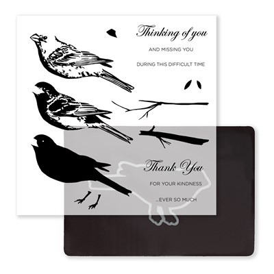
Under the Feather stamp set. I used it last month for my card class and noticed there wasn't a lot of artwork online.

I'm not fond of fussy cutting stamped images, so I needed an area large enough for the whole bird. The card design is from a retired Workshop On The Go brochure for the Frosted cardmaking kit.
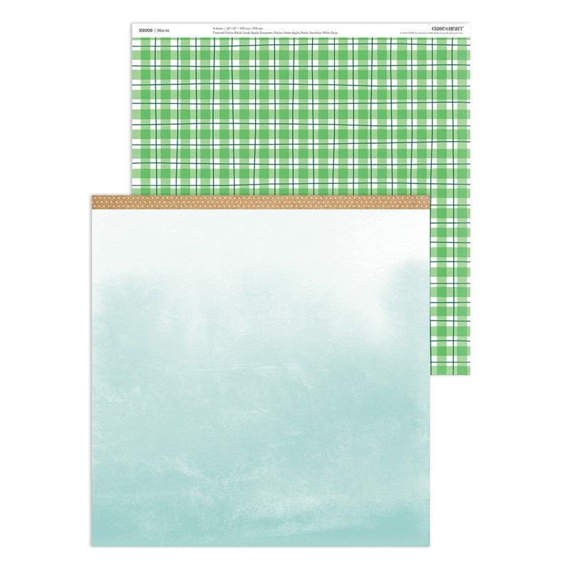
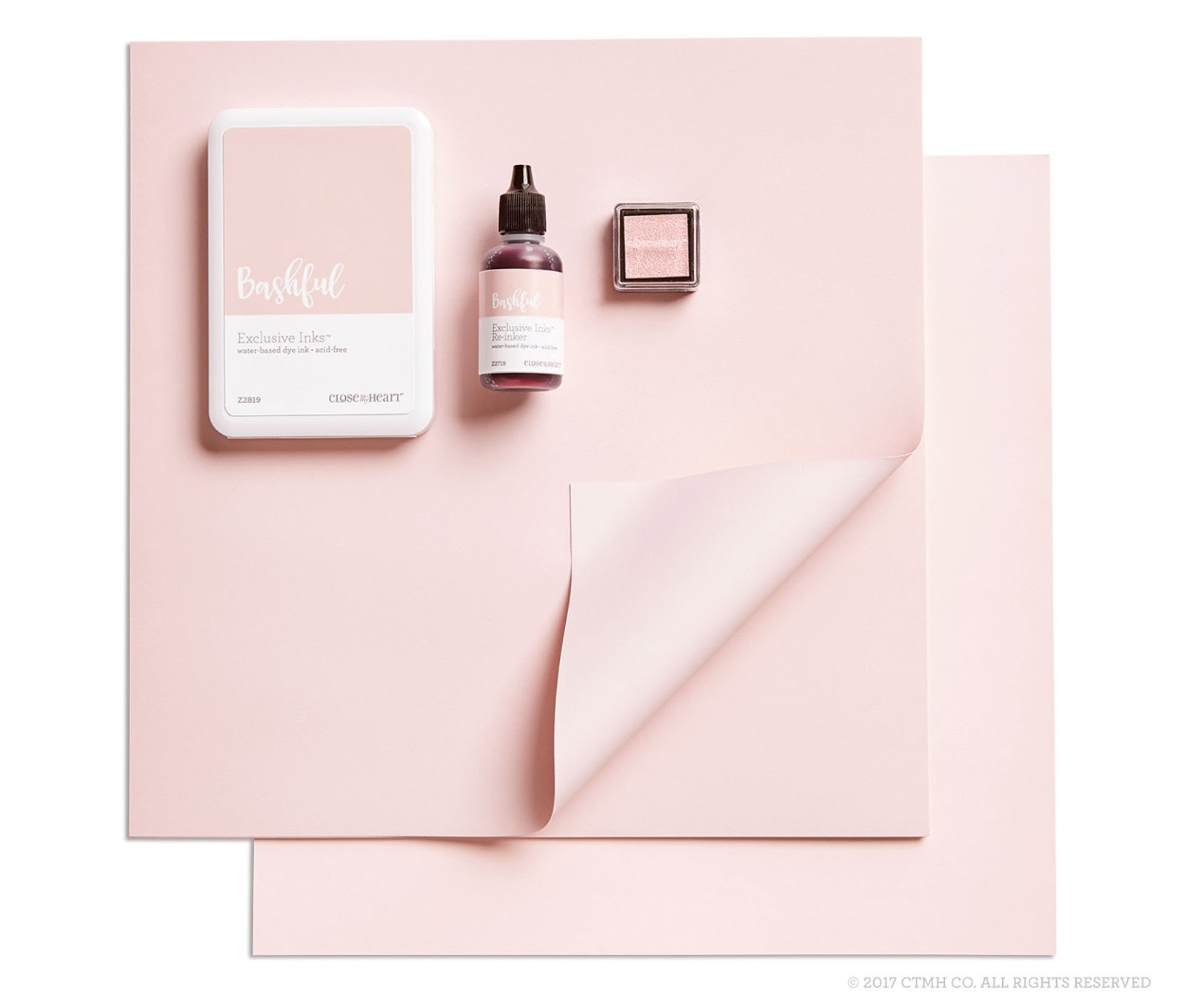
The color combo idea came from page 33 in Love of Color. DID YOU NOTICE? I switched two of the three colors suggested for similar ones in the So Much Happy collection:  Sapphire, Clover and Lagoon. DID YOU NOTICE? Our cardstock is two-toned with a white core. I used the lighter side of Sapphire on my card. It was a little softer and not as stark, IMO. It's also fun to mix both tones on the same project. You may have seen this done on 3-D flowers or in the recent Love Blossoms special.

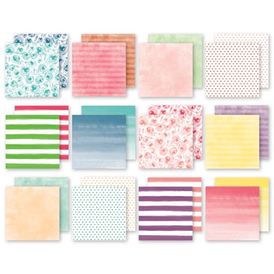
One of the reason CTMH paper packets are so versatile is that the B&T Duos are also double sided.  It also makes it hard to decide which one to use! Narrowing it down by color helps, a little. ➽ But, don't forget the zip strips! The diamond sapphire/lagoon pattern is a zip strip. Anytime you see a 1/2" or 1/4" strip of paper, even ribbon, on a design template, you can use a zip strip instead. DID YOU NOTICE? The back of the zip strip lists the name of the paper collection, paper pack item #, featured colors and CTMH copyright. You can read my previous blog entry about zip strips here.

The bird is stamped with Intense Black EI Ink. DID YOU NOTICE? We have several types of black ink. ➽Here's how to figure out which one you should use.

After I added cardstock and patterned  paper, I wasn't sure what to do with the bird. I thought the boldness of markers would make the card too busy. I used my watercolor pencils to add just a hint of the blue and green colors. DID YOU NOTICE? The pencils were updated last year. There are now 36 in the set. I had to force myself not to store them in their packaging, but where?  ➽They fit perfectly in the Workspace Wonders small tray!

Watercolor pencils are different from regular colored pencils because they can be blended and shaded by adding water. You can color normally and then blend with the brush, or you can pick up the color from the pencil tip and add it with the brush. I used the small waterbrush. DID YOU NOTICE?  We carry three sizes of waterbrush.

It's often the final details that make a card stand out. Sometimes it's a technique like edging the paper or embossing the sentiment. Or it can be the 
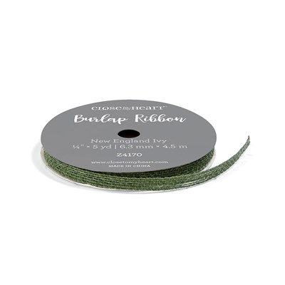
embellishments that take it up a notch. When a project looks like it's "missing something," adding an embellishment is often what it needs. The Frosted card used twine. My card uses White Burlap Ribbon. DID YOU NOTICE? The burlap ribbon can be separated into smaller widths or individual strands.
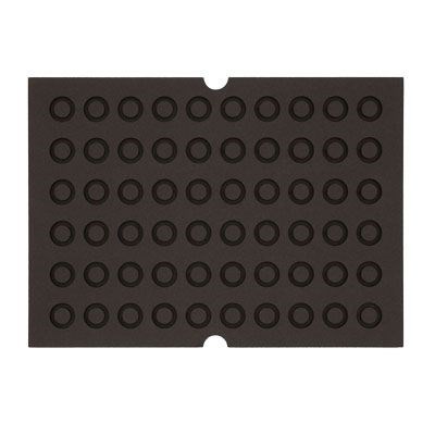
I used thin 3-D foam tape to attach the Sapphire cardstock to the card front. Not only does this add dimension, but it allows for the lumpiness of the string, ribbon, etc. we often use. DID YOU NOTICE? 3-D foam tape comes in tape or dots and both thin and regular thickness, plus specialty round window foam for shaker cards.


When making sample cards, I consider it done when the front is finished, but I never mail them that way. I love that my customers take the time to add a sentiment and often additional stamping, to the inside of their cards.


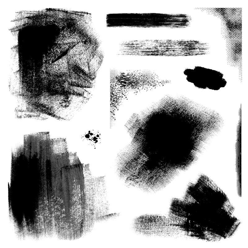
On this card, I used the small feather stamp to make a border along the side. In hindsight, it resembles a heart! When I was playing with the "fuzz," I swiped my stamp across the ink pad. Leaving the ink like that gave me a different look for the sentiment.  I think this technique is perfect for this style of stamp! Sometimes it's hard to get a good image with a solid stamp, see my tips below. I can't wait to try it with similar stamps.


➽The details are also important when you are stamping:

  • Use the "squishy thing" that comes with every Close To My Heart stamp set, or the foam side of the Versamat
  • Check your stamp for ink coverage and/or stray lint.
  • Also, make sure there isn't extra ink on the block.
  • Using a block size close to your stamp size will help prevent extra ink on the block. 
  • Check your stamping surface for excess ink. 

After all that work, stamp and/or sign your art on the back of the card. People don't throw away hand-made cards, so including the date of the occasion adds to the memory when they run across it later. When you do multiples, like Christmas cards, you can stamp the year. It's also a great place to add extra art from your assistants! I like to use a small stamp that coordinates with the rest of the card. This stamp set is also a great option for the back of your cards. It even includes the copyright in accordance with the CTMH Angel Policy.

Finally, don't forget the envelope. If you're sending happy mail, you might as well brighten up the letter carrier's day too! Plus, it guarantees that your piece will be opened first. DID YOU NOTICE? The style of our envelopes in the Value Pack make it easy to stamp without running into seams. The type with a pointy flap can be challenging. ➽ For any style, stamp with the flap in the open position for the best results.


DID YOU NOTICE? "This is Not a Bill" stamp set on page 7 is perfect for your envelopes and the back of cards!  Be sure to add it to your wish list if you are hosting a gathering with your consultant before the end of the month. If you don't have anything scheduled, contact your consultant NOW. ➽This awesome set is only available to hostesses during Seasonal Expressions 1 catalog, which retires April 30. That means time is running out on the great papers and stamp sets featured in the book and it's an excellent time to host a gathering to complete your collection. If you don't have a consultant, I'd be happy to help you (contact form on the left).

Thanks for stopping by!

Next, head over to see what Melissa is sharing this month. Her page also has a list of all the participants in case you get lost.

Products Used:


Friday, February 1, 2019

New Clearance Items!

Woot! Woot! Who doesn't like a sale? This must be a secret sale, because the products are under Going Soon instead the Clearance section, LOL!

Here are some examples of what you may find:

Fundamental papers, complements and/or embellishments
2017-18 Color of the Year - Bashful

Ink Pads (retired colors) $4.00


Cardstock - $5 for 24 sheets (retired colors)
product image
Items from past specials

Cut Above kits

Stamp and Thin Cut Bundles - 75% off
product image


Organization
product image
Embellishments
product image

Remember, all items are while supplies last, so don't wait! You can mix clearance items with current items and specials. If you reach $50, add the Stamp of the Month

Wednesday, July 18, 2018

Going Solo in July

As part of this month's Stampaganza special, we've brought back our popular Solos Alphabet and Number stamp sets.

Here are some cards I made (yes, they're originals!!) using the Solos.


Something inspired me to match up a circle with one a letters, so I turned to Make It From Your Heart, Volume 4 and found design #23. Instead of cutting a piece of paper for piece C, I used the zip strip. The B&T paper and color scheme is from the Central Park creative collection.

I added a large "13" to the inside of a birthday card behind the sentiment from the March SOTM. If you missed out, I have one left!!

Be sure to complete your collection or stock up on things Poppy and Pacifica because they will be retiring at the end of August and may sell out prior to that.


The products used in these cards were:
Products are available to purchase on my website. Or, Let Me Show You How to discover your own creativity!


Monday, July 2, 2018

News from Convention

The first bit of news is an adjustment to our Idea Book publication. We will have three issues of Seasonal Expressions, just like before, except that they will include all the current products so there's only one catalog per cycle. There will no longer be a large Annual Inspirations, year long book.  With this modification, the current Annual Inspirations will continue through August 31, 2018. Keep in mind that, as always, some products may sell out as we approach the retirement date, so shop early!

The NEW Holiday Expressions that was revealed to consultants at our annual convention this past weekend, will begin September 1, 2018 and run through December 31, 2018. This is the same Expressions schedule we have had for the "small books." The catalog has been beefed up and actually has more pages than last year's Annual Inspirations.

Let's talk colors! It should be no surprise that Bashful, the current Color of the Year will be departing to the great palette in the sky, but never fear, a new shade is on it's way! If you love this delicate pink though, don't be shy, make sure you order the re-inker for your stamp pad and stock up on the cardstock and glitter paper. 
10 additional colors will be leaving to make room for 10 new shades. Gone in the new CTMH year will be:
  • Crystal Blue
  • Juniper
  • Flaxen
  • Sorbet
  • Pacifica
  • Tangerine
  • Blossom
  • Cranberry
  • Poppy
  • Nutmeg

The mini-pigment pads are discontinued. Full size pigment pads are coming in select colors.

The Fundamentals line is retiring.

Be sure to keep an eye on my cloud based Retiring List where I've added notes and will update you as products sell out.

One of the many highlights of convention this year was having Stacy Julian, former DOTS consultant, back with us. Her new product line, Story by Stacy, expands in the 2018 Holiday Expressions. She made a quick video to give you a peek. When you're shopping STAMPAGANZA this month, be sure to add Colorful Texture and Quotable Words to your cart. Not only will you be able to get a 3rd stamp set FREE, but prices will be going up slightly on stamp sets for the first time ever.

Stay tuned for more updates and info on new products!!

More questions? Leave a comment!